Dataddo's data quality features play a crucial role in ensuring the integrity and accuracy of your data. This article offers a detailed explanation of how these features operate and their significance in maintaining high-quality data. Understanding these features is essential for effectively managing and safeguarding your data against quality issues.
To set your data quality features up, refer to the following articles:
How Data Quality Checks Work
Data quality features act as the first line of defense for your data flows, filtering both incoming and outgoing data based on established security rules and specific elements:
Depending on your destination, Dataddo provides two types of data quality features.
- Data Quality Watcher: Data Watcher is available for dashboarding apps and it provides mechanisms to alert you in case of discrepancies or issues.
- Data Quality Firewall: Data Firewall is available for data storages and it offers mechanisms to prevent corrupted or non-compliant data from entering your systems.
Null Check
Null check detects missing or unknown data in critical fields.
Null checks are crucial for critical fields such as IDs, costs, impressions, and revenue. They ensure that values are correctly collected at the source, maintaining data integrity.
Zero Check
Zero check identifies zero values, which can be in various formats like integer (0), float (0.0), string (""), or date (0001-01-01 00:00:00 +0000 UTC).
Zero checks verify the semantics of data at its source. For example, in customer revenue data, a zero value could indicate an incorrect setup. This check helps ensure that values, especially those with a low probability of being zero, are assigned correctly.
Anomalies Check
Anomalies check first determines the range of acceptable values, and then makes observations to identify outliers in a data set. It uses the P-Square algorithm for dynamic quantile estimation of streamed data types (like float, integer, date, string) without storing observations.
Example: In a data set of 1,1,1,1,2,3,5, the median value is 1.
Anomalies checks are used to detect unusual variations around the median value, namely boxplot outliers, which are data points that significantly deviate from the median value. For instance, if a product consistently has the same order count, an anomalies check can identify significant deviations on specific dates, indicating potential data issues.
Boxplot Outliers
The graph below represents a combination of a boxplot and a probability distribution, typically a normal distribution, superimposed on the same scale. This graph is commonly used in statistical analysis to visualize where most data points lie in relation to the mean (as depicted by the distribution curve) and to identify potential outliers (as depicted by the boxplot). The graph provides a quick visual interpretation of the data's spread, central tendency, and the presence of outliers.
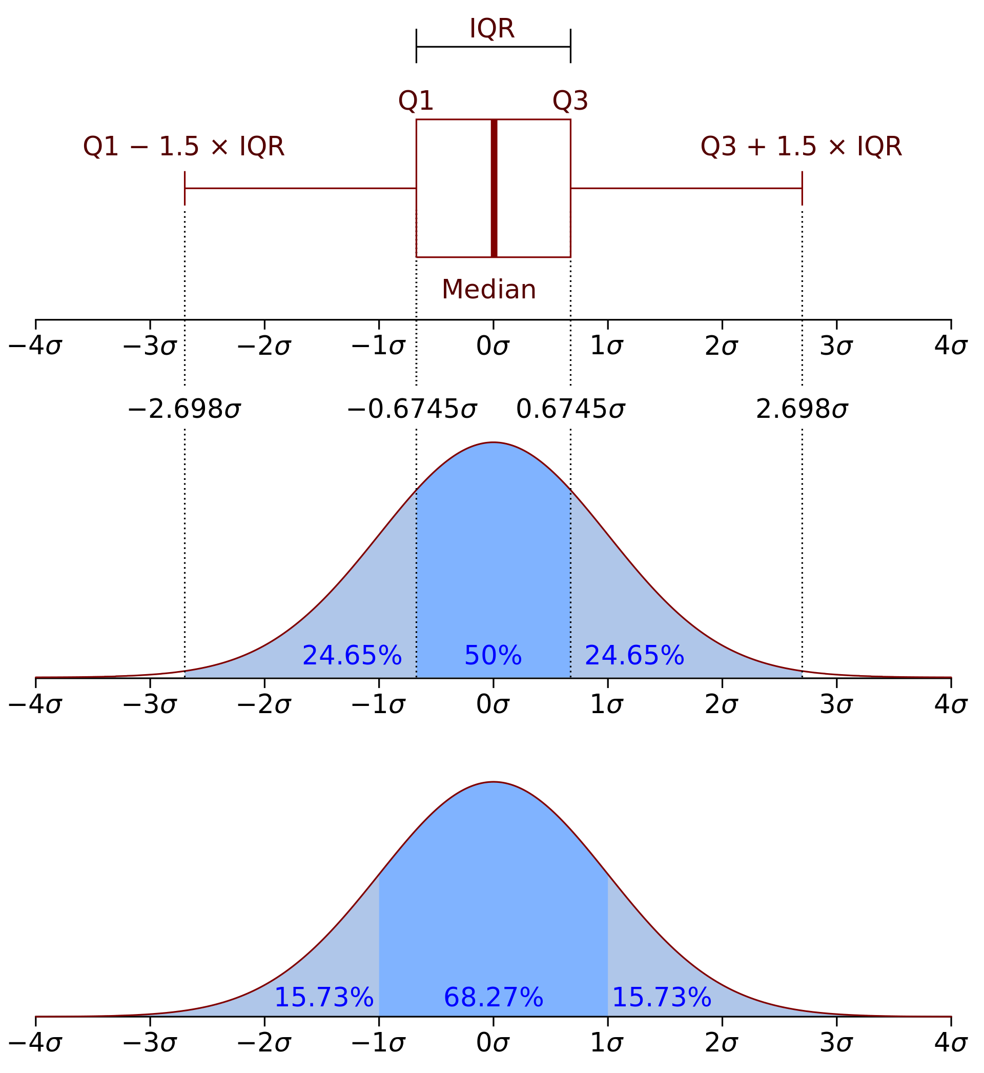
The graph depicts three types of elements: boxplot elements, normal distribution elements, and overlay of distribution percentiles.
Boxplot Elements:
- Median: The central line inside the box indicates the median value of the data.
- Q1 and Q3: The edges of the box represent the first (Q1) and third (Q3) quartiles, the 25th and 75th percentiles of the data, respectively.
- IQR (Interquartile Range): The distance between Q1 and Q3, representing the middle 50% of the data.
- Whiskers: The lines extending from the box to the points Q1 - 1.5 x IQR and Q3 + 1.5 x IQR. They represent the range for non-outlier data points.
Data points outside the whiskers would be considered outliers.
Normal Distribution Elements:
- The bell-shaped curve represents a normal distribution of data.
- The curve is labeled with standard deviation units (σ), where the center of the distribution is 0σ (mean value).
- The distribution is divided into sections representing the percentage of data within each standard deviation range.
Overlay of Distribution Percentiles:
- The areas under the curve are shaded and labeled with percentages, indicating the proportion of data within certain ranges of standard deviations from the mean.
- For example, approximately 68.27% of the data falls within ±1σ from the mean, 95.45% within ±2σ, and 99.73% within ±3σ (not all percentages are shown on this graph but are standard for a normal distribution).